20 Best Examples Of eCommerce Checkout Pages

- Main Elements of An Effective Checkout Page
- 1. Best Buy
- 2. Nordstrom
- 3. AliExpress
- 4. Myntra
- 5. Etsy
- 6. Walmart
- 7. Zappos
- 8. ASOS
- 9. Urban Outfitters
- 10. BigBasket
- Best Checkout Page Concept Designs
- 11. Minimal Checkout Page Concept
- 12. Digital Store Checkout Page Concept
- 13. Furniture Store Checkout Page Concept
- 14. Retail Store Checkout Page Concept
- 15. Online Store Checkout Page Concept
- 16. One Step Checkout Page Concept
- 17. Electronic Store Checkout Page Concept
- 18. Checkout and Booking Page Concept
- 19. Single Product Checkout Page Concept
- 20. Bake Shop Checkout Page Concept
- Conclusion
The checkout page is arguably the most important page on an eCommerce website. Yet, most designers give far less attention to it than it deserves.
Imagine adding a few items to a shopping cart and proceed to checkout only to be confused by lengthy form filling that never seems to end. You don’t want to be making that same mistake with your eCommerce website.
The checkout page is where you convert a visitor into a customer. And it’s a page that needs to be designed to provide a smooth transition for all types of users from educated college students to seniors.
To help you find the best design for your own website’s checkout page, we took a tour around the Internet and found a list of great checkout page designs.
These are the checkout pages that generate thousands of dollars worth of sales every day, or maybe even more. They are optimized for success. You can definitely learn a lot from them. Take a look.
Main Elements of An Effective Checkout Page
Designing an effective checkout page requires more than just spying on your competitors and browsing Dribbble for several hours for inspiration. You also need to know the ins and outs of all the elements and tools of checkout design.
- A Minimal Form Design: Don’t confuse and annoy users by asking for too much information. Minimize the checkout form to collect only the most important data such as name, email, shipping address, and payment details. And nothing more!
- Create A Step-By-Step Process: Guide users through each stage of your checkout page, including personal details, billing, and shipping.
- Allow Users To Customize Orders: Some users will want to change their order and quantity after visiting the checkout page. Let them make changes directly on the checkout page.
- Let Customers Register An Account: Don’t force users to register an account before checkout. While it generates leads, it can be annoying to one-time customers. Give the option to register an account after the checkout process.
- Minimize Promotions: Limit your promotions such as add-on product recommendations, coupons, and discounts to a minimum.
Now, let’s take note of some of the best checkout pages in business.
1. Best Buy
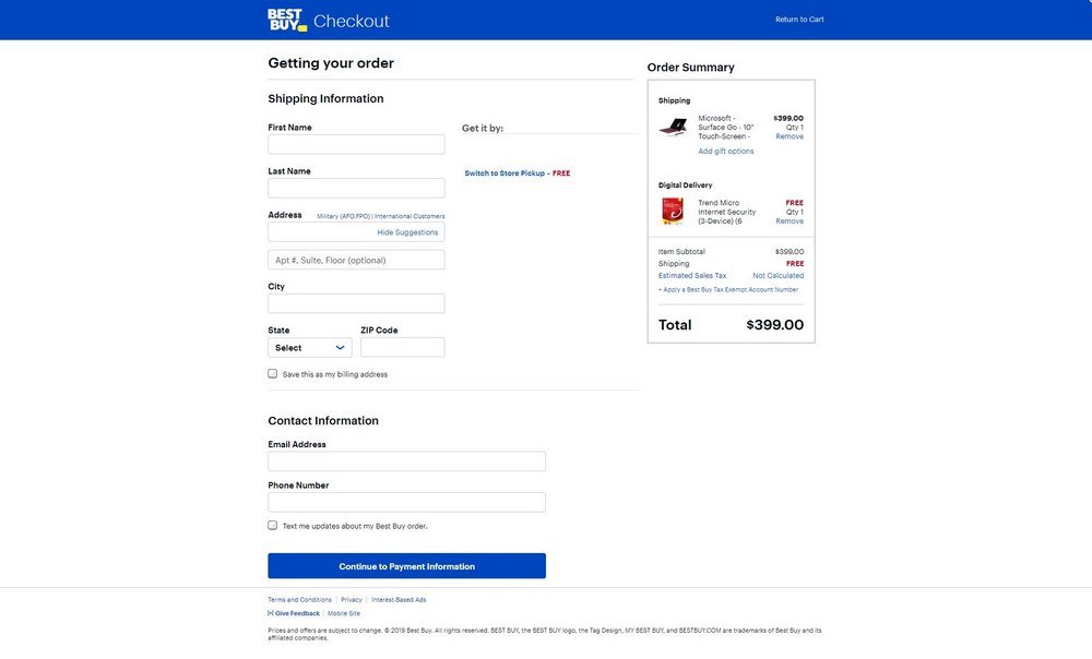
The best feature of the Best Buy website’s checkout page is simplicity. It only asks for the shipping information and contact info. Then you can proceed to the payments page.
To avoid confusion and clutter, Best Buy has divided the checkout process into multiple pages. It also allows users to check out items as a guest or sign in to an account.
2. Nordstrom
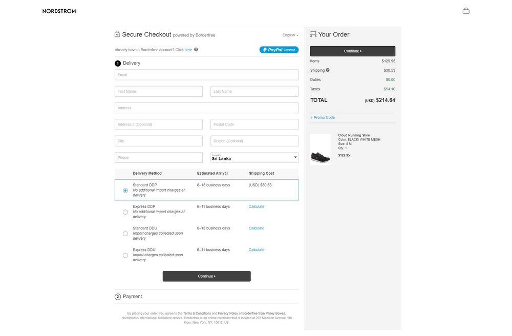
Nordstrom also has a very clean and minimal checkout page. The website process orders in 2 steps. In the first step, customers are required to fill out their contact and shipping info. Followed by payment methods in the next step.
The way the checkout page showcase shipping options is quite inspiring. It makes things a lot easier for customers to choose the right shipping method for delivery.
3. AliExpress
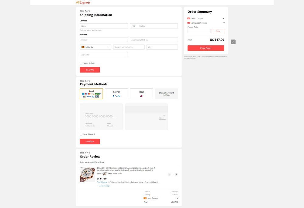
AliExpress features a simple checkout process that can be completed in 3 steps. Even though it requires registration before proceeding to checkout, the site collects minimal information. And shows easier payment options highlighted with logos.
The best part is that customers can edit and customize their orders in the last step. It allows you to change the quantity and apply coupon codes as well.
Once you save your shipping and payment info with the website, your next checkout becomes much easier and the site simply shows the checkout page as a pop-up modal window to process the order in a few clicks.
4. Myntra
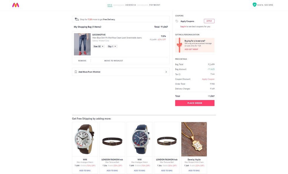
The Indian fashion online store Myntra has one of the fastest checkout systems we’ve seen. You can not only jump to the checkout page in 2 clicks but it also loads within milliseconds as well.
What we loved about Myntra’s checkout page is the ability to add more items from your wishlist to the shopping bag (or shopping cart). Once the order is placed you can proceed to enter the shipping info and select payment methods. However, it requires you to signup with an account.
5. Etsy
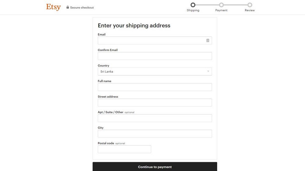
Etsy is the biggest arts and crafts online store that empowers creators to make art and sell them online. Etsy’s checkout page is also inspiring. In fact, it’s the simplest checkout page we’ve seen.
Etsy lets you proceed to checkout as a guest without account registration. And it includes a simple step-by-step checkout process with a clutter-free design.
6. Walmart
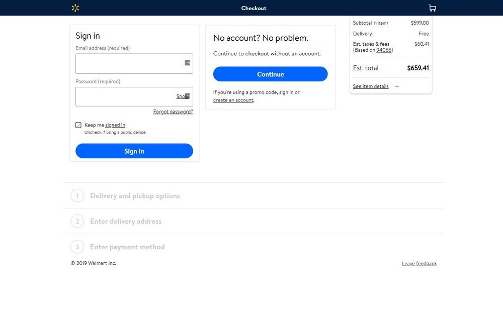
Walmart store is also kind enough to allow its customers to check out items without requiring account registrations. Its checkout system supports two different options. Customers can either have items delivered or pickup from a store near them. Each option has minimal forms that are easier to navigate and only has a 3-step process.
7. Zappos
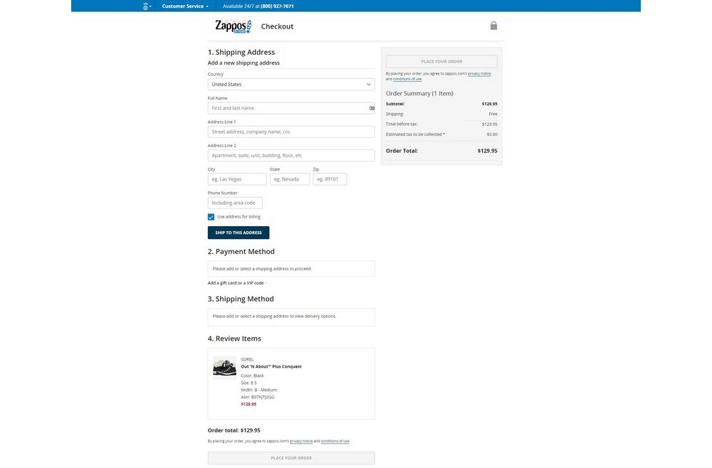
Zappos checkout page is a bit long. But it’s quite easy to navigate and features a step-by-step process to guide users through each step. Although, it does require users to signup or sign in with an account.
Overall, Zappos checkout page is pretty straightforward and offers a smooth experience to even the new users.
8. ASOS
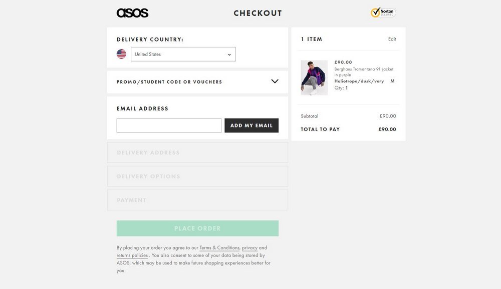
ASOS, the British hipster fashion store also uses a modern checkout system. The step by step process of this checkout page is quite user-friendly and also looks really smooth on mobile devices as well.
ASOS uses a 4-step checkout process. However, it can be improved by combining the shipping address and shipping method into a single step.
9. Urban Outfitters
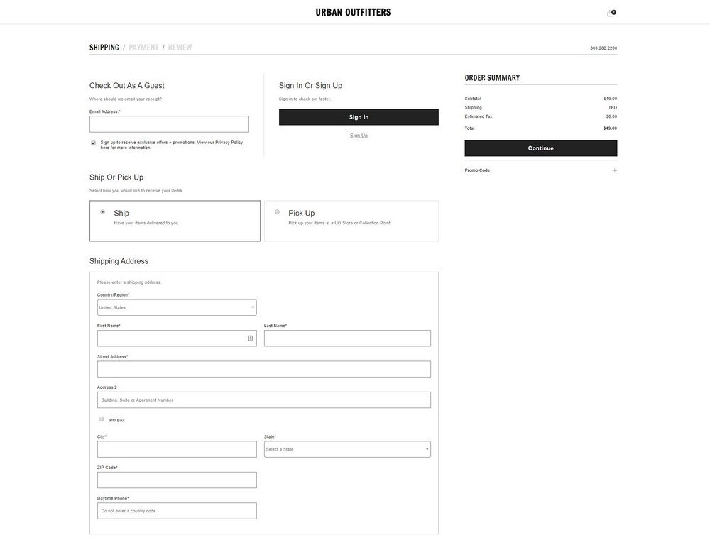
Urban Outfitters also has a checkout page similar to Walmart. It lets you either have items delivered or pick up from the nearest store. The site uses a 3-step process that collects customer contact info in the first step and payment details in the second step. In the third step, it allows customers to review their order one last time before making the payment.
10. BigBasket
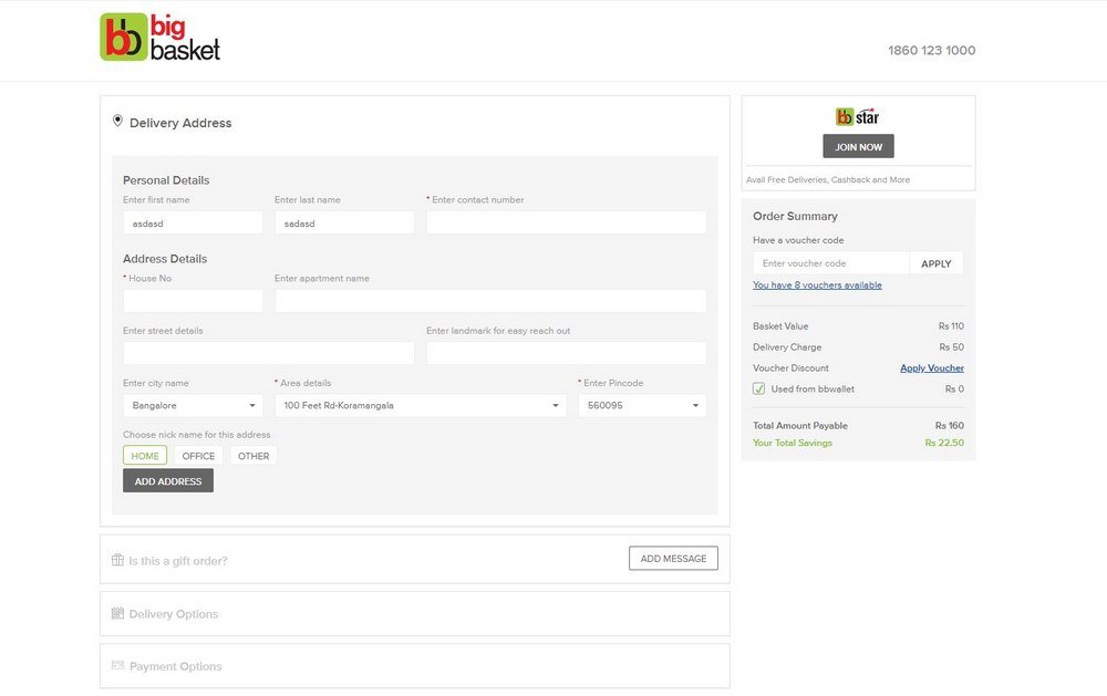
The Indian online grocery store BigBasket also has a very clean checkout page. Customers are able to easily select and apply vouchers directly from the checkout page. And it features a simple step-by-step process. Although, it was a bit confusing to see a gift order option on a grocery shopping website.
Best Checkout Page Concept Designs
The followings are checkout page concepts and prototypes other designers have created for businesses. These designs feature innovative layouts and unique elements that are worth taking note of.
11. Minimal Checkout Page Concept
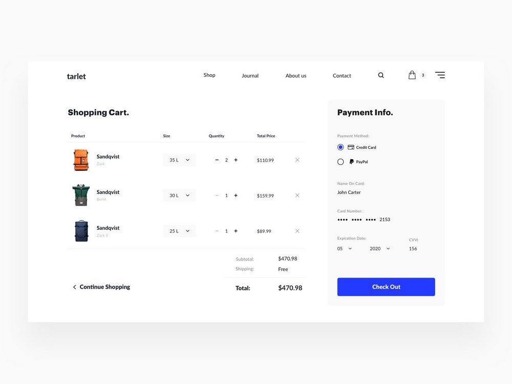
This elegant checkout page concept made by Eugene Lazarev is ideal for a modern online retail or fashion store. The minimal compact layout allows customers to add payment info directly from the shopping cart as well.
12. Digital Store Checkout Page Concept
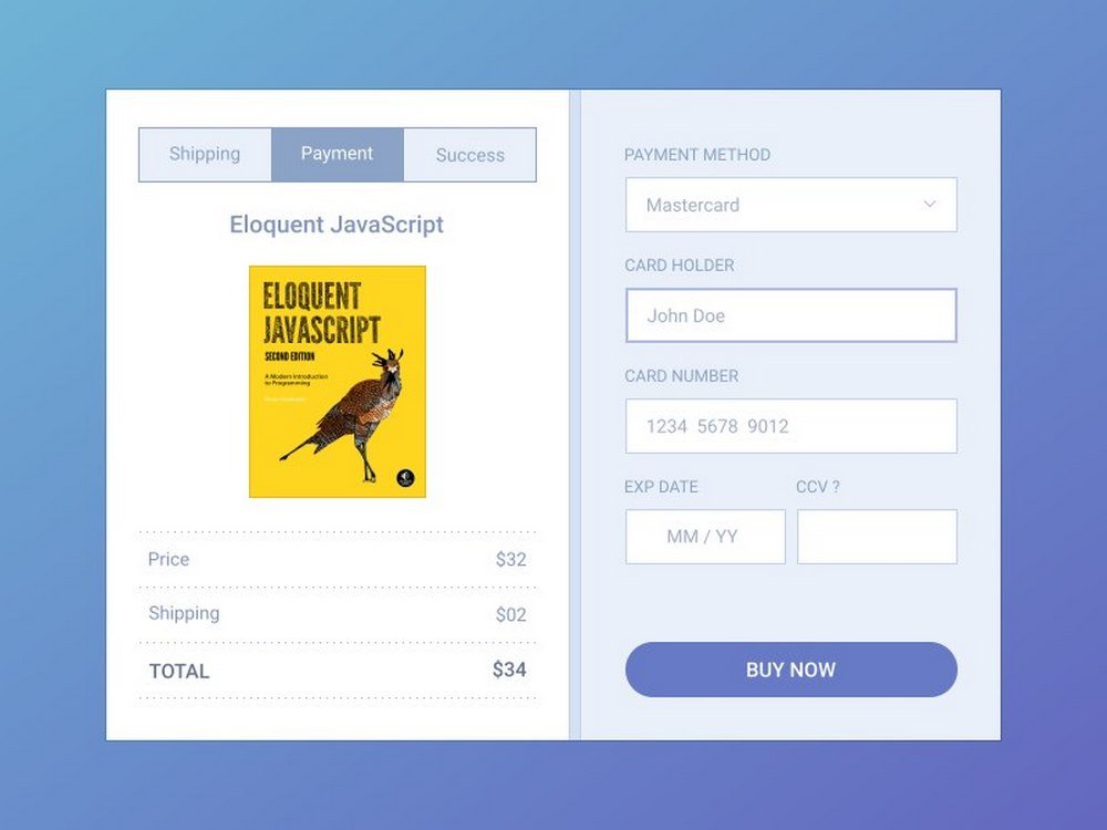
This stylish checkout page is most suitable for online stores selling digital products such as eBooks and online courses. The concept page designed by Milos Andjelkovic features a lot of useful options and elements that you can implement to your own designs.
13. Furniture Store Checkout Page Concept
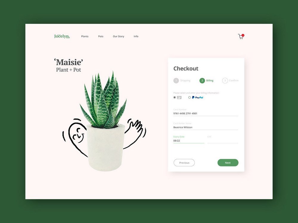
An elegant checkout page designed by Alex Perry. This concept design features a creative layout that’s ideal for home decor or a furniture store. The designer was envisioning this concept for a botanical or flower delivery service.
14. Retail Store Checkout Page Concept
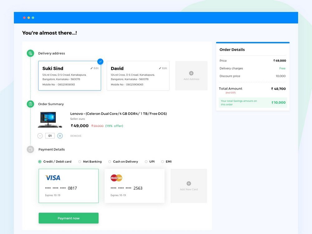
It’s simple yet straightforward. This is a modern retail store checkout page designed by Srinath. It features a very smooth user interface that shows a nice flowing process for collecting shipping info, payment details, and reviewing order.
15. Online Store Checkout Page Concept
This is a concept checkout page designed by Mahisa Dyan Diptya for a shipping and delivery app. The layout features a clean step-by-step process for guiding users through each step.
16. One Step Checkout Page Concept
Kasper Christensen’s creative checkout page design features a simple checkout process. The main idea is to pack all the details into one compact design to let users checkout items from a single page.
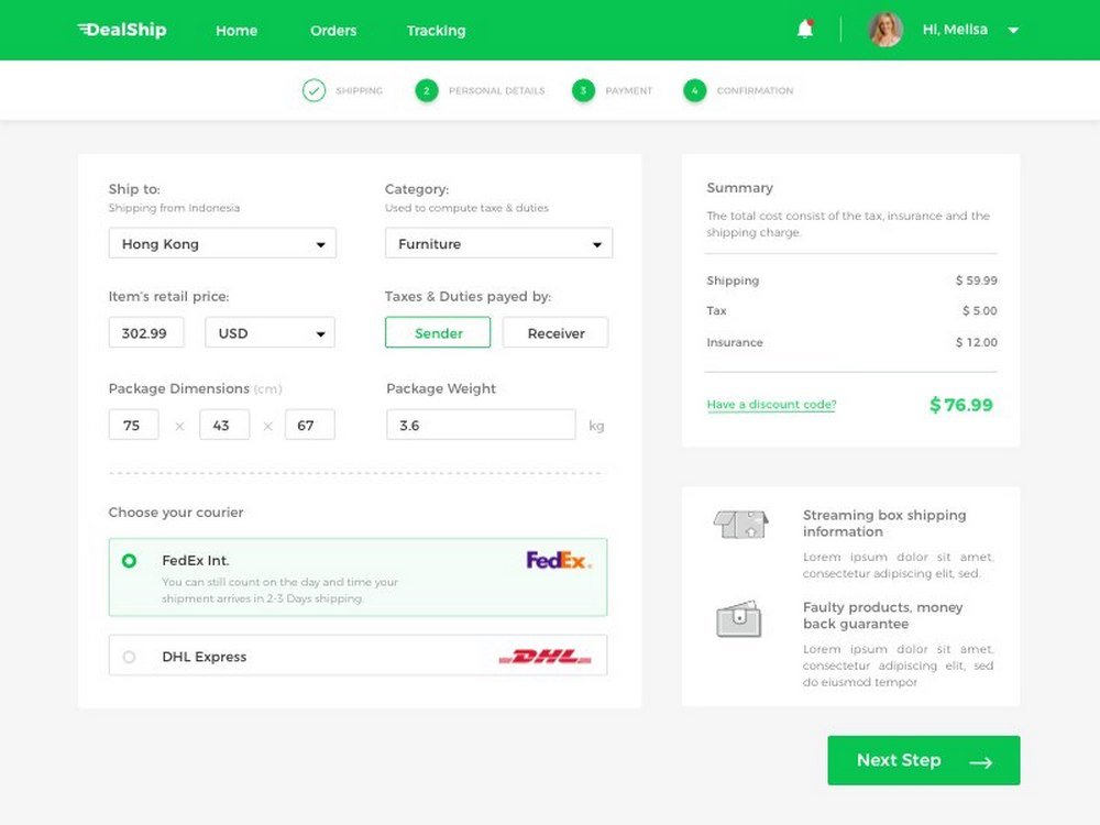
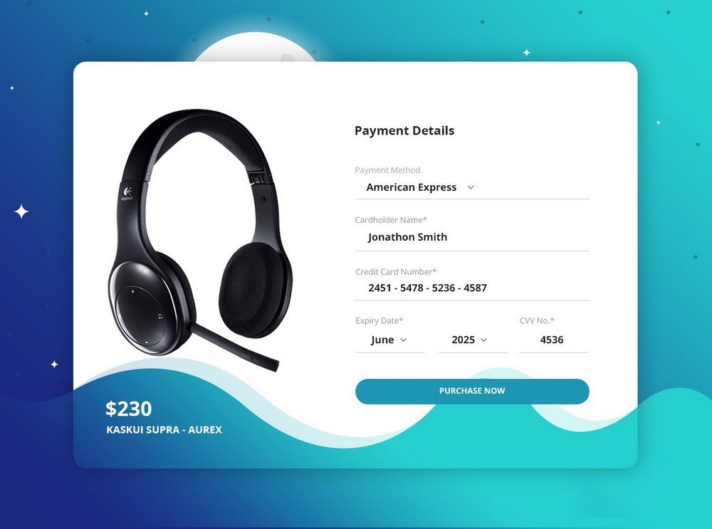
17. Electronic Store Checkout Page Concept
A modern checkout page concept designed by Vel Kumar P. This one is ideal for electronic stores and single product stores.
18. Checkout and Booking Page Concept
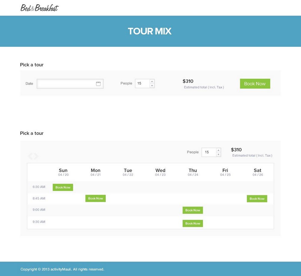
If you’re planning on making a checkout page for an appointment booking site or a platform, this design is a great source of inspiration. The concept is crafted by Sheikh Naveed for B&B style hotels and resorts.
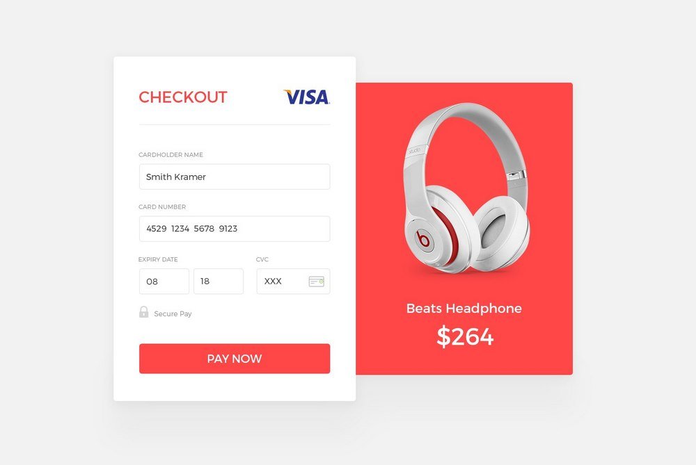
19. Single Product Checkout Page Concept
This stylish checkout page concept by Tonmoy Karmoker is great for implementing a pop-up modal window checkout page for online retail stores.
This stylish checkout page concept by Tonmoy Karmoker is great for implementing a pop-up modal window checkout page for online retail stores.
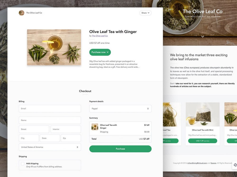
20. Bake Shop Checkout Page Concept
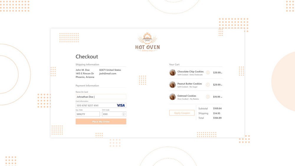
Another simple and elegant checkout page concept made for an online bakery shop website. The design by Josh Tucker has all the right elements of an effective checkout page.
Conclusion
A great way to test and improve your checkout page process is to implement heatmapping and leveraging A/B split testing.
A website design is never complete. You have to keep improving and updating to stay relevant. Take your website a step further by checking out our article on how to increase your average order value (AOV).


Leave a Reply